
Enjoy a free 30-day trial of our
data validation software.Experience the power of trusted data
solutions today, no credit card required!Enjoy a free 30-day trial of our
data validation software.Experience the power of trusted data
solutions today, no credit card required!Enjoy a free 30-day trial of our
data validation software.Experience the power of trusted data
solutions today, no credit card required!Enjoy a free 30-day trial of our
data validation software.Experience the power of trusted data
solutions today, no credit card required!
Shifting gears: A data-driven perspective on bicycle share services


I recently received an email from Hubway, the bicycle-share program here in Boston. The subject read “Join the 2017 Hubway Data Challenge presented by Microsoft – over $7,500 in prizes.” Now for a little bit of background information, I am a regular user of Hubway. I live next to a docking station, so to get to work every day I take it to the nearest subway stop, which also has a docking station. I do this again on my way back home each night. On the weekends, I sometimes take it to the gym, which conveniently has two docking stations within walking distance. On a few occasions, my wife and I will bike from Fenway Park after a baseball game to the closest Red Line subway station to avoid the foot traffic. Let’s just say I use it a lot.
Anyway, back to the e-mail. Hubway is inviting people to analyze their data, which they have made public. While the contest is centered around visualizations, it’s often helpful to do some preliminary analysis to see what’s interesting to visualize.
Now, if only I had an easy-to-use software to load this data.
Oh wait, I do! While Experian Pandora is mainly touted as a data quality tool, the fact is that it can handle data in the most generic sense. And by handle I mean filter, transform, calculate, etc. But before I can do all that, I need to ingest all the data.
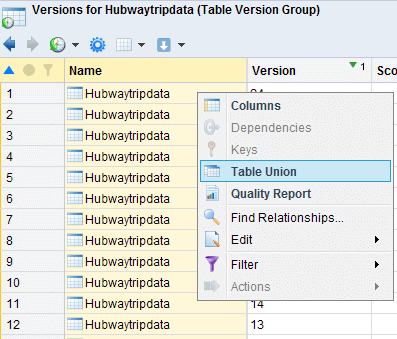
For the past two years, January 2015 through December 2016, there is one CSV file per month. I loaded the 24 files into Experian Pandora and noted that they all contain the same field names. Ctrl-A (all), right-click, and union. Done! I now have just over 2.3M records for each of the rides in those 24 months.
Now, what might I want to look at?
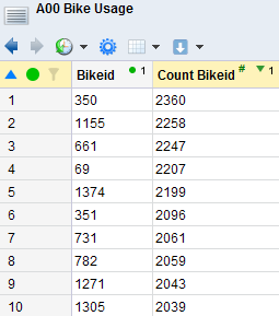
First off, we can look at bike usage. As a frequent biker, I can tell you that the conditions of bikes vary greatly. The baskets come loose, brakes squeal, handlebars slip off, seat height adjuster gets stuck, etc. By grouping by 'Bikeid' and the adding a group count, we can see which bikes get the most usage, which ranges anywhere from 1 to 2,360 (median of 1,492). Now, this doesn’t exactly tell the whole picture, as we don’t know how long each bike has been operational, how many times they’ve been serviced, etc. If we did enrich it with maintenance data, it could be used to recommend scheduled service. And that’s just a warm-up!
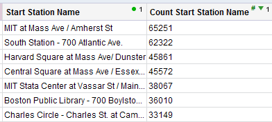
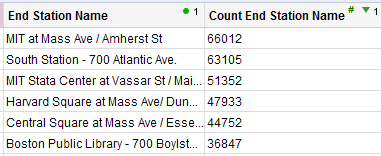
We can now do the same thing with docking stations to see which stations are used the most. We can group by start/end station and do a count. MIT at Mass Ave was the most popular starting station at 65,251, with South Station following closely behind at 62,322. If we repeat with the ending station, we see similar results with MIT at Mass Ave at 66,012 and South Station at 63,105. An interesting side note is that South Station actually has the largest docking station with 47 spots whereas MIT at Mass Ave has 27. If we were to normalize these by the number of spots at each docking station, MIT at Mass Ave would have an even bigger lead!
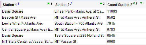
But let’s see which station pairing has the most popular trip, aka which two stations have the most trips in between (whether from A to B or from B to A). To do this, we can create two new fields, Station 1 and Station 2. Station 1 is the minimum of the start/end stations and Station 2 is the maximum. This ensures that trips that are A to B or B to A will both end up with values of A in Station 1 and B in Station 2. I couldn’t believe my eyes! Davis Square to/from Linear Park is the top. That’s the route I take every day to/from work. I’d like to think I had something to do with that.
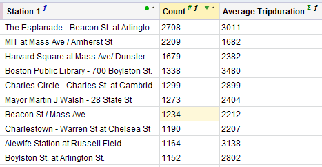
We can also look at rides that start and end at the same station. The Esplanade shows up at the top, followed by MIT, Harvard, and the library. We can also show the average trip duration for each. I can see why a person may take out a bike on The Esplanade (there’s a scenic path along the Charles River) for 50 minutes. I can also see students at MIT and Harvard jumping on a bike for quick errands (28 and 40 minutes, respectively).
Any of these results can be further investigated. Do rides along The Esplanade mainly happen in the nicer warmer months? How does weather affect ridership in general? I know I typically bike short distances even when it’s raining out because I want to get somewhere quicker, but my wife prefers to walk under an umbrella. Is there a gender that rides more often (by the way, it’s a huge ‘yes’). How about a certain age group that rides more (again, huge ‘yes’)?
In more and more meetings with customers, we are hearing about business reporting–how many patients were admitted (broken down by demographic, department, etc.), how many purchases are made across the different channels (again broken down by demographic, brands, etc.)? Tools like Experian Pandora can help solve some of these big challenges. How can it help you?
Get a free trial of Experian Pandora to see what it can do for your business!
