No one should dispute the importance of mobile in today’s shopping journey. But what may be disputed is whether the focus should be on mobile apps or mobile browsers. I’m here to tell you why, before you go all out in developing a mobile app, you should consider optimizing your mobile browsing experience first.
It may go against what a lot of your peers are saying, but the mobile browsing experience is paramount to the mobile app experience. Your mobile apps house your most loyal customers; they’ll come back to you no matter what (unless, of course, you miss spectacularly on their expectations). If you want to continue growing your customer base, however, making sure new shoppers have a good experience all around means investing in a better mobile browsing experience. Let’s find out how to go about that, shall we?
Mobile trends and the impact on retailers
Based on research reports done by Kleiner Perkins and UPS, mobile usage can be traced back to more and more revenue every year.
- 77 percent of all online shoppers have used a smartphone at some point in the purchase process
- 44 percent of those shoppers actually purchase something on their smartphones
- 70 percent of site traffic during the 2015 holiday season originated from mobile
- Mobile ad revenue grew over 66 percent
- 37 percent of all purchases in 2016 took place on mobile
- This holiday season, 60 percent of omnichannel shoppers will purchase more on mobile
Smartphones are here to stay. If you haven’t begun to invest in mobile, you should really think to do so. I’m not talking mobile apps, I’m talking about making about the mobile website. With as much shoppers using smartphones and laptops as interchangeably as they do, making the desktop and mobile browsing experience as similar as possible is quite imperative.
Mobile browsers vs. mobile apps
Speaking of which, you may be asking why I’m hating on mobile apps as much as I am. It is because mobile apps are designed for a specific audience in mind. These are heavy users, loyal to the brand and prone to making immediate purchases with short conversion times.

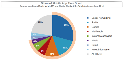
Looking at the pie graph above, combining the usage rates for Social Networking, Internet Radio, Games, and Multimedia mobile apps together will get you over half of time spent on mobile (61%). If you look at Retail mobile apps, you can see that the usage rates are just at three percent. What this should tell you is that just because people are jumping the bandwagon to develop mobile apps, doesn’t mean people will download them, keep them on their phone, or use them.
What this should give you is a healthy dose of perspective: mobile retail apps are for the truly loyal. So if you have a core user group and you’re seeing consistent numbers with your mobile app, keep doing what you’re doing. But if you’re seeing lackluster performance with your app, and you’ve diverted resources away from other mobile initiatives, really consider investing in the website instead.
Why should you optimize the mobile browser experience
Many times, a website is the first touch point a shopper will have with your brand. If they are a new face to your company, the last thing you want to do is scare them away with horrible site design/navigation and an even more ghastly checkout experience.
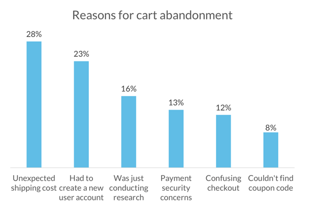
The checkout experience is where a lot of skittish customers can drop off completely from completing a purchase, so that’s where I’ll deem mobile optimization efforts most important. The average cart abandonment rate as listed by the Baymard Research Institute is 69 percent.
Here are some reasons for high cart abandonment:

In summary—how to make a mobile app experience for the non-app user
Making a mobile app experience for a non-app user is really about switching the resources devoted to making mobile apps to mobile browsers instead. It’s about making the browser experience as streamlined and simple as an app’s experience would be. It’s about asking for as little information as required and decreasing the barriers to conversion as much as you can.
In short, there’s only one thing you need to keep in mind when optimizing mobile: Keep it simple. There’s no need to add all the bells and whistles as long as you keep in mind what the most important, which is making it as easy as possible for the customer to use your website at the point where most people drop off—at checkout. Basically, we’re telling you to:
Make it simple for customers to enter contact information
- Reduce keystrokes (industry standard is 25; we do it in 9)
- Auto-fill relevant form fields
- Eliminate needless form fields (e.g. “Confirm email” fields)
Mobile retail apps are popular and no doubt can be a great source of revenue—but only for those lucky few that have a solid base of loyal customers. It doesn’t work for everyone. Not every customer will go through the hassle of downloading an app to make a single purchase. That’s why making the mobile browsing experience a great one is not only a way to convert new customers into loyal customers, but also a way to help reduce the dreaded cart abandonment rate.
See how we’ve helped retailers in the past improve their mobile checkout experience.
Learn more


